Raising The Bars for Visualizing Numbers
By M. Adil Yalçın, Niklas Elmqvist, and Benjamin B. Bederson
Have you ever looked at listings of countries, smartphones, and universities, wondering about trends in their population, price, or number of employees, respectively? The well-known bar chart helps us quickly understand such numeric data from a modest number of records. However, when you have data from hundreds of universities or smartphones, a traditional bar chart will create a very long list. Trying to fit the list into a small space will create skinny bars with labels that are impossible to read. What are alternative compact charts that will let you see all of this information in a quick glance while still being readable? And, how well do they perform for accurate data perception?
A comparison of two existing alternatives: Treemaps and Wrapped Bars
Our research, which will be presented at GI 2017, evaluates two existing compact chart designs, “treemaps” and the less common “wrapped bars”, to find out which one performs better for dense numeric data. Treemaps were first designed, extended, and evaluated in their many forms at the Human-Computer Interaction Lab. Today, treemaps have many applications, from finance to business intelligence and even art, for presenting hierarchical information effectively. For example, treemaps can show you both the overview and the details of how much space your files and their hierarchy in folders take. However, treemaps are also used in practice for just a non-hierarchical list of numbers as a way to fit many numbers in a single compact chart. Wrapped bars, which were first proposed by Stephen Few, offer an alternative approach based on traditional bar charts. This chart design breaks a bar chart into multiple columns, following a natural reading order from left-to-right columns, to show more data in a limited space.
Below, we illustrate both chart types using election data, showing the number of electoral votes (using block size) and the winning political party (block color) for 50 states in the U.S, based on 2012 presidential elections. You can find a more detailed comparison of both chart types in our paper.
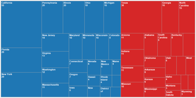
Above: Treemaps are a “space filling” approach, filling the entire chart area with rectangles that show data values. This treemap shows records grouped by winning party (Figure from DataRevelations blog). The distribution across the parties is emphasized.
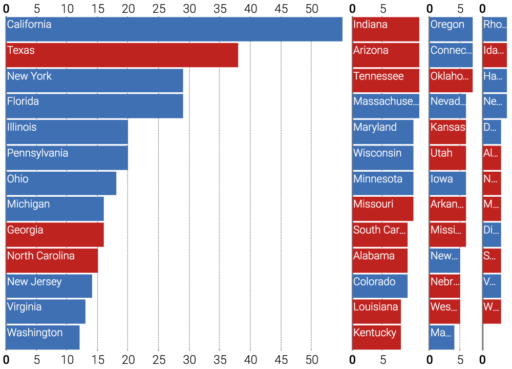
Above: The wrapped bars use length to map data values, and whitespace to distinguish the multiple columns. This wrapped bars shows states ordered by electoral vote. We can observe that among the states with higher number of votes (leftmost column), Democrats won more frequently.
To understand graphical perception performance, we studied three basic tasks:
1) How accurately can we estimate the difference between two data points?
2) How accurately can we estimate the rank of a data point among all the rest?
3) How accurately can we guess the distribution characteristic of the whole dataset?
Our study was done online using crowdsourcing on Amazon Turk, which provides a paid marketplace for quick micro-tasks by anybody who has access to a computer. So, you could be one of the people who contributed to our study from the comfort of your chair! You can still try our experiments by visiting adilyalcin.me/chubuk.exp. (Your data won’t be collected).
Our results show that wrapped bars lead to a more accurate perception of the underlying data than treemaps. This outcome applies in most of the conditions of our study, which was in a casual setting where each data point remains distinguishable in a target chart size: up to 300 records in a mid-size chart. Our results are consistent with previous work which shows that the perception of area (basis of treemaps) is less accurate than the perception of length (basis of wrapped bars). The accuracy of estimating ranking in treemaps is also lower than wrapped bars, which use a simple order from top-to-bottom within columns, and left-to-right across columns. Other specific results include that our participants ranked selected records more quickly with treemaps (although also less accurately), and that wrapped bars made skewed distributions easier to observe than treemaps. You can find the details of our study design, conditions and results in our paper.
So, should you use treemaps to visualize a large list of numbers? If you want your data to be perceived more accurately, you should be cautious, and we recommend starting with wrapped bars. Nowadays, treemaps are easy to create with with numerous visualization tools, which also explains their popularity among practitioners. To our knowledge, there are not any common tools that can create wrapped bars, so we created one for the web, which we named Chubuk.js. Check it out here!
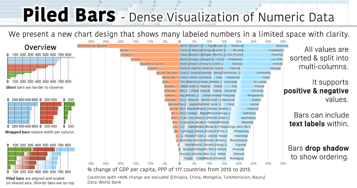
Piled Bars: Introducing a new chart for dense visualization of numbers
In the GI 2017 poster session, we also introduce a novel chart type that we call Piled Bars. It increases the data resolution over wrapped bars by having all the columns share the same baseline. However, this design produces overlapping bars, since there are multiple columns in each row, where shorter bars are shown over the longer ones.
We include the full poster below to demonstrate this new approach, using some real data which shows 177 countries and their % change of GDP per capita PPP values from 2010 to 2015.
Additional resources
- Raising the Bars: Evaluating Treemaps vs. Wrapped Bars for Dense Visualization of Sorted Numeric Data. M. Adil Yalcin, Niklas Elmqvist, Benjamin B. Bederson. Proceedings of Graphics Interface, 2017 – PDF
- Piled Bars: Dense Visualization of Numeric Data. M. Adil Yalcin, Niklas Elmqvist, Benjamin B. Bederson. Poster presented at Graphics Interface, 2017 – PDF
- Chubuk.js – A JavaScript library that produces piled bars and wrapped bars. Live – Source Code
References
- Tree-maps: A space-filling approach to the visualization of hierarchical information structures. Johnson, Brian, and Ben Shneiderman. Proceedings of the 2nd conference on Visualization ‘91. IEEE Computer Society Press.
- The publications about Treemaps from the Human Computer Interaction Lab at University of Maryland: http://www.cs.umd.edu/local-cgi-bin/hcil/sr.pl?number=treemap
- Graphical perception: Theory, experimentation, and application to the development of graphical methods. Cleveland, William S., and Robert McGill. Journal of the American statistical association 79.387 (1984): 531-554.
Visualization research at the HCIL has a long and proud history, going back to the founding of the lab in 1983. Today, visualization researchers at the HCIL conducts research in information visualization, visual analytics, and data science. Mehmet Adil Yalcin is a Ph.D. graduate from Computer Science at University of Maryland, College Park. Niklas Elmqvist is an associate professor of Information Studies at the University of Maryland, College Park and a member of the HCIL. Ben Bederson is a professor in the Computer Science Department at University of Maryland, College Park, and the Associate Provost of Learning Initiatives and Executive Director at Teaching and Learning Transformation Center of the same university.