Actions may Speak Louder, but Words Provide Context: Visualizing Multimodal Data to Understand Collaboration
VizScribe, a visual analytics framework, can be used by researchers to understand collaboration by interactively exploring speech and video information along with other forms of data.
— by Senthil Chandrasegaran, Sriram Karthik Badam, and Niklas Elmqvist
Qualitative studies of collaboration between designers involves sifting through multiple forms of data, such as video, transcript, sketches, text, and more recently, even data from activity trackers. We use visual analytics to help view such data in context, and to help the qualitative researcher make sense of such multimodal data. The visual analytics framework we propose, called VizScribe, allows the researcher to view such data interactively as events on a timeline, and use the video and transcript to provide context.
Today, product design and development is a global venture, requiring multiple teams of designers to work together in close proximity to each other as well as to coordinate with other remote teams. There is a constant need for better products and processes that support these teams of designers. Consequently, there is a need to understand how designers think and work, both by themselves and in teams. This is partly the responsibility of design researchers, who often study designers by recording them in the act of designing, and carefully studying their actions and speech.
With recent advances in activity trackers and other biometric technologies, we have additional means of recording actions and responses. For instance, activity trackers can be used to identify when people sit around in a discussion, or move over to a whiteboard to sketch an idea. Wearable proximity sensors can be used to observe the formation of smaller groups within a team over a design session. The challenge, then, is to make sense of this data: what does a spike or a flatline in an activity sensor mean? What was the wearer doing when that spike occurred? Was it a meaningful action, such as reaching across the table to discuss a part of a design sketch, or a routine action, such as reaching across the table to pick up a pencil? It becomes tedious to try and figure this out by switching back and forth between a reading of interest and the corresponding time in a video. Even without this additional data, it is difficult to answer questions such as “how often did the designers discuss a particular concept?”, “at what point in the meeting did they first come up with the concept?” from the video alone.
VizScribe is a visual analytics framework that supports researchers in answering these questions, by allowing them to interactively view the sensor data alongside the video and transcript, and make sense of designers’ actions and speech. The browser-based interface (see image above) is split into two views: a temporal view on the left shows time-sequence data, and a text view on the right shows the main view of the transcript, and a thematic overview of the transcript in the form of an interactive word cloud.
Temporal view: Providing Context to Actions
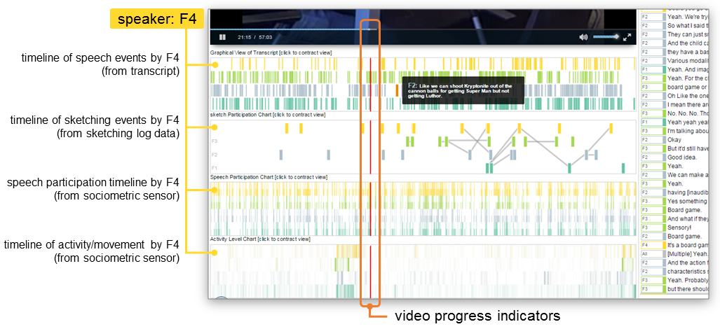
The above image shows a detail of the temporal view. We are all used to perceiving time from left to right when we watch videos, thanks to the video scrubber. We take this idea further in VizScribe, and provide additional information aligned with the video timeline. For instance, in a group discussion, how do you skip to all instances of just one team member (let’s call her F4) speaking, without scrubbing through the entire video? We provide markers for each person’s speech in the speech timeline, based on the transcript and timestamps. Similarly any recorded actions such as server logs, data from activity trackers, etc. are added in the form of additional timeline views. Each participant in the collaboration session is assigned a color that is carried across all views.
These views are interactive: clicking on a timeline marker, say, a spike in a view of activity tracker-logged data, skips the video to that particular time (and scrolls the transcript view to the text spoken closest to that time), so that the viewer can see what the spike means; whether it was something significant such as moving to a board to illustrate an idea, or simply standing up to stretch one’s legs.
Text Views: Finding and Categorizing Patterns and Anomalies
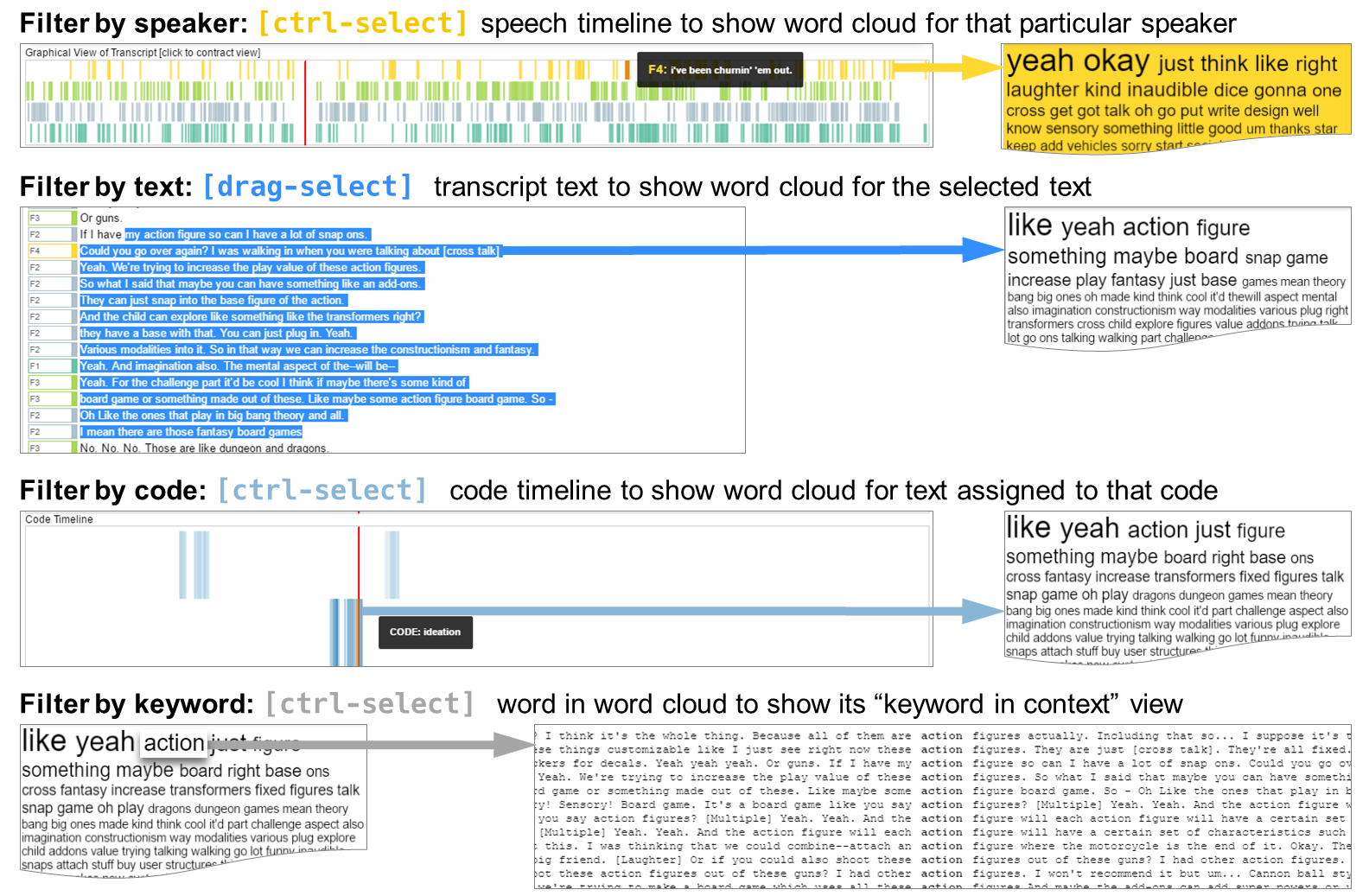
The text view has three main components: the detailed, time-stamped transcript, an interactive word cloud generated from the transcript, and a section to create and view “codes”. Codes here refer to qualitative coding, a process of identifying units of data as belonging to a particular category, and assigning them to that category. For instance, in a collaborative design session, the act of critiquing an idea or design can be seen as a category of action/speech, and all instances of speech that involve critiquing ideas over the entire design session can be assigned to that category.
Using the word cloud makes it easier for the analyst to sift through the text: once they read through the transcript, they can identify keywords that typically occur around a kind of action/speech. Selecting a keyword highlights all its occurrences in the transcript (and shown in the transcript timeline view, too). The researcher can then go to those specific occurrences, observe the context in which the word was uttered, and decide whether or not it falls under this category of behavior. The word cloud can also be filtered to show an overview of only selected text, or one particular speaker’s utterances (see image above).
We tested VizScribe on directed and open-ended tasks, with novice as well as experienced practitioners, some of whom had used existing qualitative analysis tools. The response was very positive: participants found new ways to explore the data views, each often finding different ways to answer the same question. For details of the framework and the user studies, please refer to the journal article (link provided below)
More Information
This paper has been published in the International Journal of Human-Computer Studies (link to article). The full citation is:
Chandrasegaran, S., Badam, S. K., Kisselburgh, L., Peppler, K., Elmqvist, N., & Ramani, K. (2017). VizScribe: A visual analytics approach to understand designer behavior. International Journal of Human-Computer Studies, 100, 66-80.
Got New Data?
VizScribe is an extensible framework: if you have new sets of data that you want to view, or create new timeline views yourselves, the code is available on GitHub, with a Wiki providing details on customizing and extending VizScribe. For details, see the links below:
Source Code: https://github.com/senthilchandrasegaran/vizScribe
Wiki page with instructions to download, install, and if needed, extend the framework: https://github.com/senthilchandrasegaran/vizScribe/wiki
Video: https://vimeo.com/169905057
Visualization research at the HCIL has a long and proud history, going back to the founding of the lab in 1983. Today, visualization researchers at the HCIL conducts research in information visualization, visual analytics, and data science. Senthil Chandrasegaran is a postdoctoral researcher at the iSchool in the University of Maryland, College Park and a member of the HCIL. Sriram Karthik Badam is a Ph.D. candidate in Computer Science at University of Maryland, College Park and a member of the HCIL. Niklas Elmqvist is an associate professor of information studies at the University of Maryland, College Park and the director of the HCIL. This work is done in collaboration with Lorraine Kisselburgh and Karthik Ramani from Purdue University, West Lafayette, and Kylie Peppler from Indiana University, Bloomington.