Understanding Data by Having Computers and Humans Work Together
By Zhe Cui, Karthik Badam, Adil Yalcin, and Niklas Elmqvist
Understanding data using computer data science tools can be seen as a collaboration between the analyst and the computer. Most data tools put the analyst in the driver’s seat to guide the analysis. For example, in Excel, you need to select rows and columns and choose which chart type to use to calculate values, create charts, and develop insights. Such tools completely rely on the user to understand the data. However, this one-sided arrangement is not sufficient for modern large datasets and complex analytical scenarios when (1) the user is unaware of the best methods to transform, arrange, and analyze the data, or (2) is overwhelmed by the sheer scale and complexity of the data (or both).
In a recent research project, we explore an alternative approach that supports the analyst by providing automatic insights from the data through visualizations. This proactive approach leverages any available computer power to run data analyses automatically in the background and present insights (or “a-ha moments”) that can aid the analyst’s exploration. Our tool, DataSite, is an example of this idea that is designed to improve the coverage of the data the user views, the qualities of insight collected, as well as the user’s engagement during data analysis.
The Role of Automation in Generating Insights
An insight is an observation of value made from data in the sensemaking process. In visual sensemaking, people create data visualizations through tools such as Microsoft Excel and the industry-standard tool Tableau to extract trends, patterns, and outliers, eventually leading them to form insights. However, this process can be overwhelming if performed manually when dealing with a large number data items with many attributes, for example all of the students and their data enrolled at a university, or the sales data over time for a multinational company. The main challenge here is that the user will not know what the visualization looks like until it is shown, and this “trial and error” process can therefore be long and exhausting.
At the core of our work is the idea that computers can alleviate this burden by automatically generating observations and “useful” charts. After all, computing has always been about simplifying people’s lives. The same should be true of data analysis.
While this is thought-provoking, there is no perfect definition of an insight yet (John Stasko discussed this aspect more specifically in his recent blog post), which complicates our goal of proactive computation. However, “insight” has often been a subjective word and heavily depends on the goals of analysis and the user, as well as the domain. For instance, a paper from Tang et al. at SIGMOD 2017 developed algorithms to extract top insights from a dataset based on a database perspective in order to help enterprises make better and faster decisions.
Blending the Best of Human and Machine Capabilities
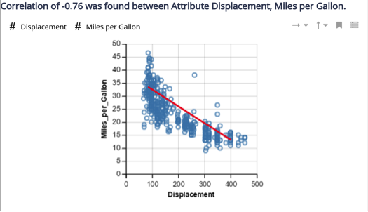
Our proactive approach is based on the core philosophy that “human thinking is expensive, whereas computational resources are cheap.” DataSite utilizes computer resources such that when the user analyzes and visualizes the data, the computer or server (or even a cluster) simultaneously executes appropriate automatic analyses on the data in the background to suggest interesting leads to the user to investigate as a next step. For instance, while observing the differences between cars with different horsepower, DataSite suggests differences in Miles per Gallon based on a correlation analysis that was automatically executed in the background.
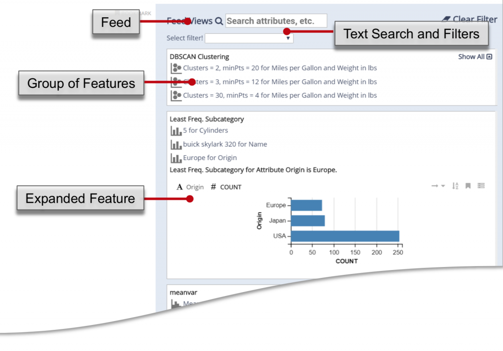
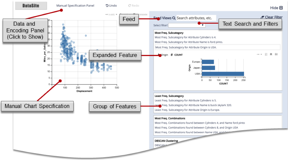
By continuously executing all conceivable analyses on all combinations of data dimensions, DataSite uses brute force to generate automatic insights. This enhances the analyst’s awareness of the data in the data exploration process by both choosing best practice analysis methods as well as eliminating the need for the human to perform costly calculations. The computer-generated insights are presented through a user interface element called the feed view, which streams continuously updating results from computational analyses, akin to social media feed such as on Twitter or Facebook. Each result is accompanied by a visualization that highlights the result in the context of the data items. This leads to an analytical workflow that mixes the best of human and machine intelligence.

Better Insights and User Engagement through Proactive Insights
We evaluated our approach in DataSite through two user studies of open-ended visual exploration. In these studies, we compared DataSite to manual visualization (Polestar) and visualization recommendation (Voyager 2), respectively. In DataSite, we focused on standard automated analyses such as computation of statistical measures for mean, variance, and frequency of items, and standard data science methods for clustering, regression, correlation, and dimension reduction. The task for studies is the same: exploratory analysis of unknown data (also called “open-ended task”). We used 2 tools with 2 datasets (one dataset on each tool interface). Participants started with one tool and dataset, and then moved to the second interface. They were asked to explore the dataset “as much as possible” within a given time of 20 minutes and were encouraged to speak out aloud their thinking process and insights. Three major benefits of DataSite emerged from this study:
- Broader coverage: DataSite shows 30% increase in data field attribute coverage compared with Polestar. There are more multi-attribute charts (encoding two or more data attributes) that participants viewed and interacted with using DataSite than Polestar. When compared with Voyager 2, DataSite has comparable data field attribute coverage but provided more meaningful charts.
- More time spent on charts: Most participants spent at least 25% of their time on exploring the feed itself. All participants felt that the feed is useful for analysis and provides guidance of “where to look” in the data.
- Better subjective ratings: People rated DataSite more efficient and comprehensive than Polestar and Voyager 2.
The Future of Proactive Analytics
DataSite can be seen as a canonical visual analytics system in that it blends automatic computations with manual visual exploration. We regard it as the first step towards a fully proactive visualization system involving explicit human feedback in the loop, such as tasks people are doing, data attributes people care about, and advanced analysis people want to dive into. Besides, inferential statistics and user behavior based recommendations can also be integrated to provide user-guided recommendations of insights. A truly intelligent visual analysis system would leverage possible feedback from user and computational power from the computer to present easily understanding and interpretable insights.